top of page

Strike Bold. Sip Sharp.
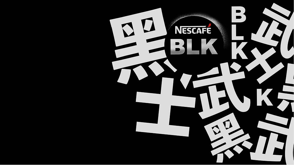
Nescafé sought to design a premium and youthful package for its black coffee line in China, emphasizing the sharp and crisp sensation of drinking black coffee. Inspired by samurai precision and swiftness, the design features bold Chinese typography. The clean, modern look integrates black, red, and metallic accents, with high-quality finishes to enhance the premium feel, delivering a powerful message of energy and clarity akin to a samurai’s strike.
Category
Package Design
Typography Design


bottom of page